UltraCare Pharmacy — Refill Tracking for a Community Pharmacy
Full redesign and frontend build for a community pharmacy — refill tracking, transfers, and auto-refill. Live in production.

The Problem
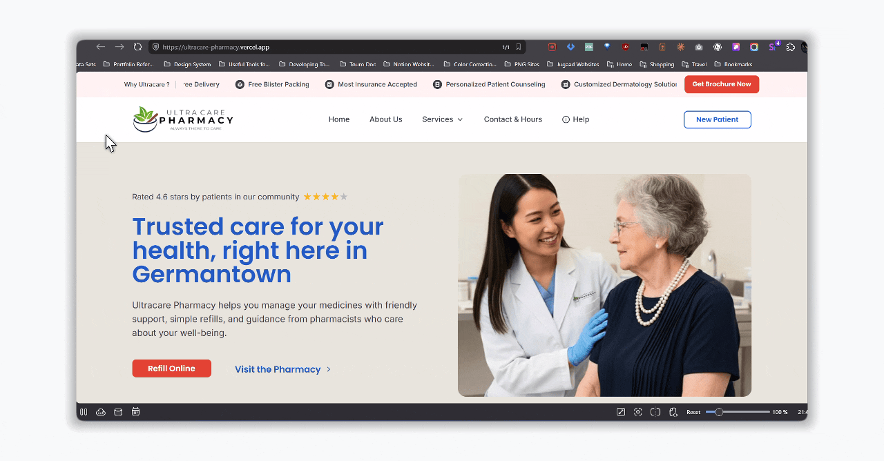
UltraCare is an independent community pharmacy in Germantown, Maryland. Before the rebuild, patients had no real online interface — refills, transfers, and auto-refill enrollment all happened by phone. The front desk fielded a steady stream of calls that should have taken seconds: is my refill ready, can I transfer this prescription, can I sign up for auto-refill. Each call interrupted the pharmacy team's actual work.
Independent community pharmacies sit between two extremes — large chains have polished but impersonal portals, and most small-town pharmacies have no web presence at all. UltraCare needed the polish of the chains without losing the personal trust they had built in person.
My Role
I owned this project end-to-end. I ran the early conversations with the pharmacy team, mapped the information architecture, designed the visual system and wireframes in Figma, built the entire frontend in Next.js and React, and shipped it to Vercel. There was no design-to-engineering handoff because the same person held both files. The site is live at ultra care.
Constraints
- Healthcare audience across all ages — accessibility, readability, and clarity over clever layouts.
- Trust over conversion — community pharmacies live on trust; the site couldn't feel like a chain-store funnel.
- No backend at this stage — no patient database, no pharmacy management system integration. The refill tracker had to work with a minimal demo data layer.
- Short timeline, small surface — a handful of pages and one core tool. The discipline was choosing what not to build.
Insights
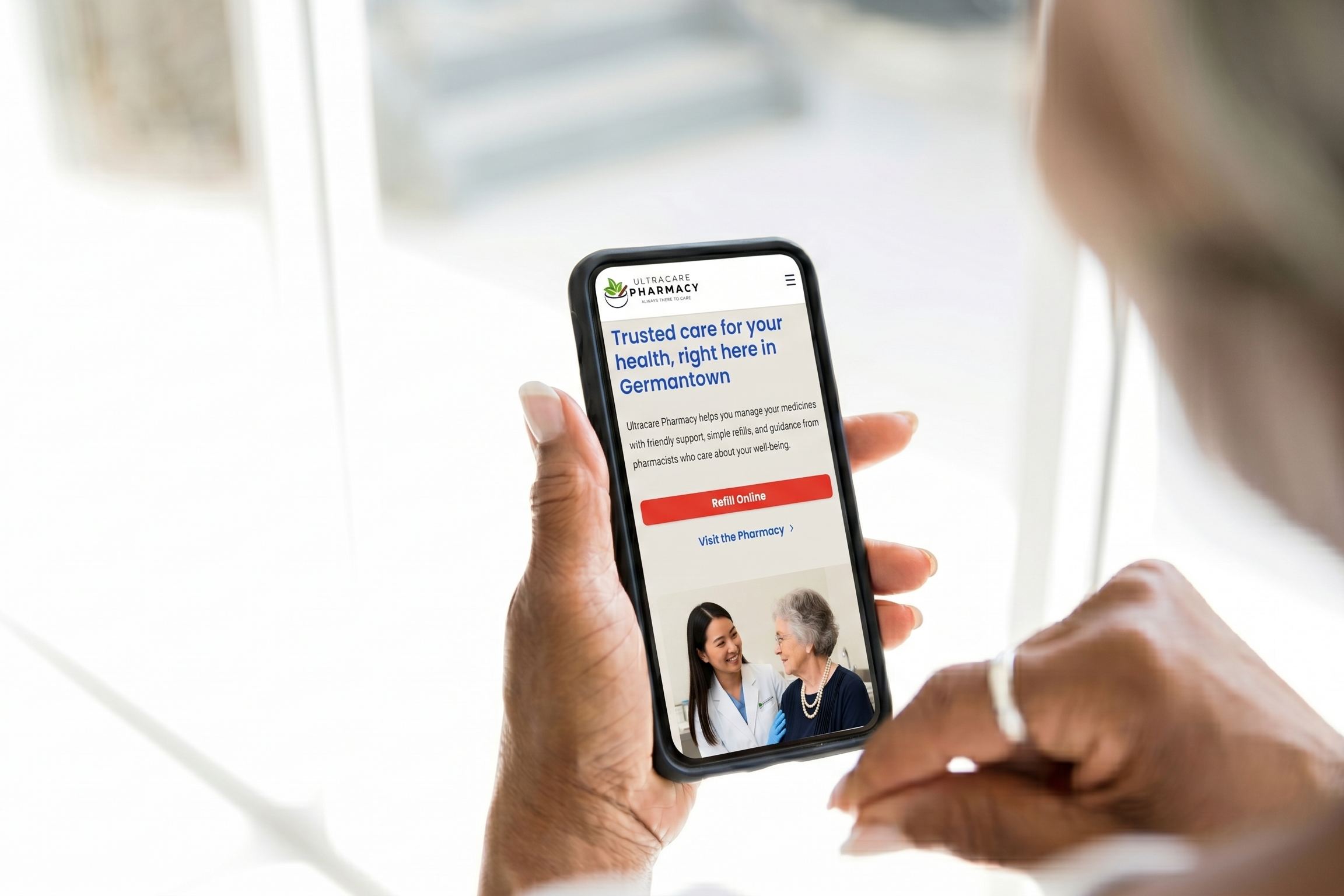
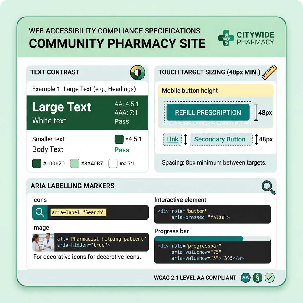
Designing for elderly patients drove every decision. Multi-step wizards lost them. They preferred a single long form where every field was visible before committing. Plain-language copy beat clever microcopy. Large tap targets and high contrast weren't nice-to-haves — they were the design center.
Error states matter as much as success states. When an Rx number doesn't match, the form doesn't just say "invalid input" — it surfaces the pharmacy's direct phone number and a clear next step. In healthcare, a dead-end error message is the moment a patient picks up the phone and overloads the front desk. A useful error message routes them to the right place.
Trust signals carry more weight than feature lists. A clear local address, real photography, the pharmacist's name, and the pharmacy's actual phone number on every page do more for patient confidence than any amount of marketing copy. The site had to feel local because it is.
Process
The flow — one form, four outcome states
The refill tracker isn't a single happy path. It's a state machine. A patient enters their Rx number, name, and date of birth and lands on their medication list — then on one of four outcome states for any given prescription: Ready (pick up when convenient), Waiting (refill being processed), Delayed (there's a hold, here's why), or Low Supply (you may run out soon — contact your doctor or pharmacy). A fifth state — Error — handles invalid Rx numbers by routing the patient straight to the pharmacy phone line.
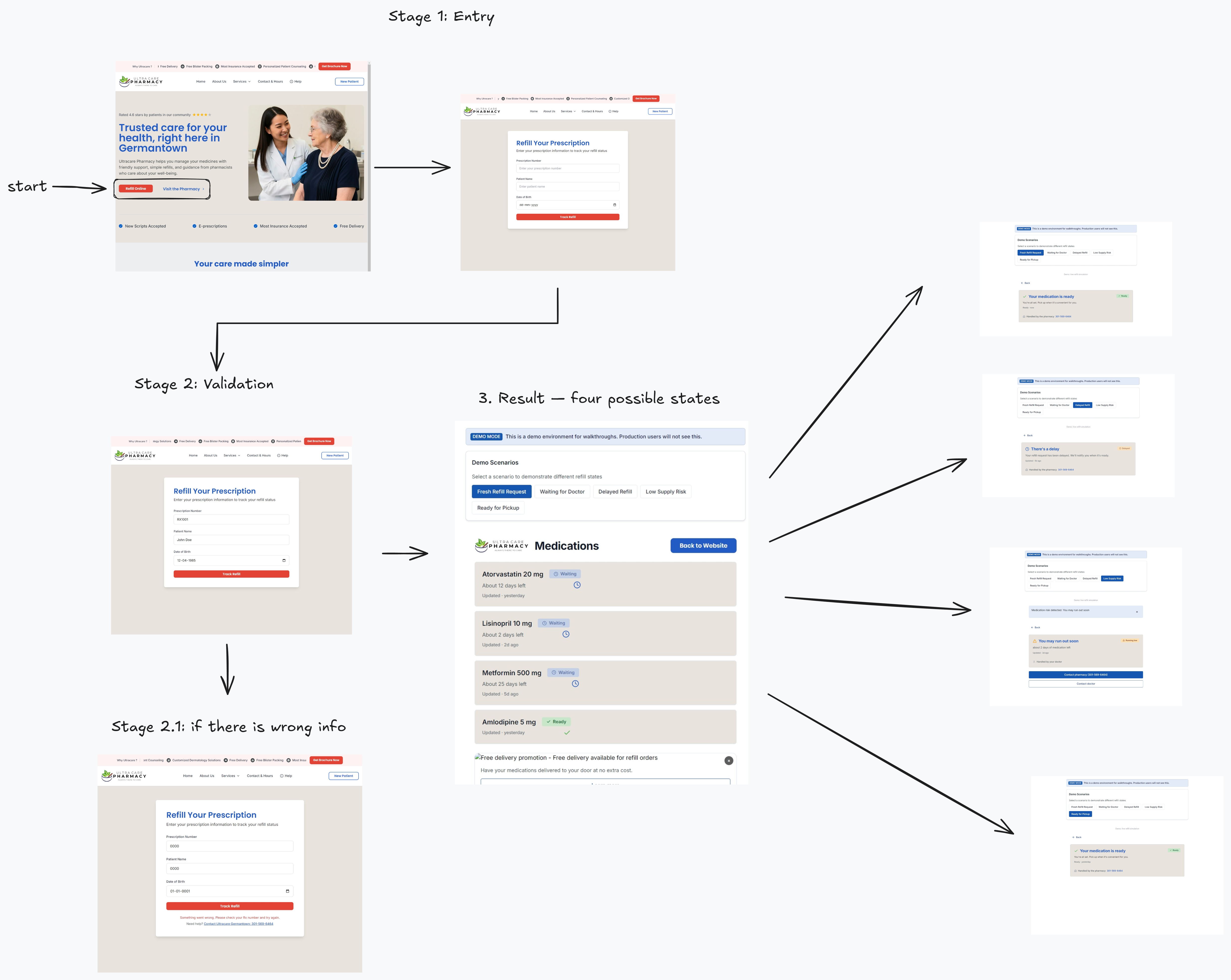
Each state is its own designed surface, not a generic "status: X" template. The Delayed state explains that there's a delay without lecturing about causes. The Low Supply state surfaces two contact buttons because the next action might involve the doctor, not just the pharmacy. The Error state shows a one-tap phone link. The states differ because the next action differs for each one.
The tradeoff: designing five state surfaces instead of one took longer than shipping a single "status: ready / not ready" toggle would have. The gain is that each state lands the patient on the right next action without forcing them to interpret what the status means. In healthcare, where patients are often anxious and time-pressured, removing interpretation from the path matters.
Foundation: a small but disciplined design system
Before designing a single page, I built the foundation in Figma — a color palette anchored on UltraCare's brand green, a 4-point spacing scale, a clear type hierarchy with one display family and one body family, and a small set of primitives: buttons, input fields, cards, status pills, navigation, and footer.
This wasn't design-system theater. The product had four real surfaces — homepage, refill tracker, transfer page, contact — and a handful of states. A heavy design system would have been overhead. But a consistent one meant every page felt like it came from the same place, and the frontend could be built from a small set of reusable React components instead of one-off markup. Design tokens in Figma mapped directly to Tailwind classes in code. The same green appeared in both files because they referenced the same value.
The tradeoff: time spent on the system early meant less time on visual flourish later. The site is not the most visually distinctive pharmacy site on the internet. It is the most legible one for the patient I was actually designing for.
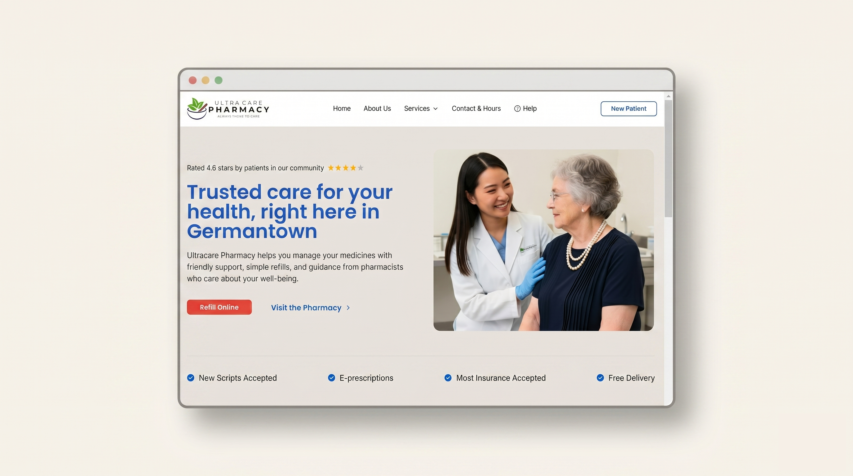
Decision: Lead with the three actions patients actually need
Refill, Transfer, and Auto-refill enrollment surface immediately as primary navigation links and large hero buttons. Everything else — services, savings, consultations — sits below.
Friction removed: a patient with a job to do never has to scroll, scan, or interpret. The three things 95% of visitors come for are the three biggest buttons on the page.
The tradeoff: the homepage looks less like a marketing site and more like a utility. We lost the chance to lead with a brand story. For UltraCare's audience, that was the right loss. People come to a pharmacy website with a job to do, not a story to absorb.
Decision: No login — Rx number as the key
Most pharmacy portals require account creation before showing prescription status. For an audience that includes elderly patients and one-time users, account creation was the wrong barrier. The goal was a quick status check, not an ongoing relationship with a portal.
I designed the refill tracker around the Rx number as the access key. A patient enters their Rx number, name, and date of birth — three things already on the bottle in front of them — and lands on their refill status without ever creating an account.
The architecture underneath: the form posts to a small validation layer that checks the Rx number against a controlled list of demo patient records (Rx number + name + DOB). Rx numbers are case-insensitive so "rx1001" and "RX1001" both work — a small detail that matters when an elderly patient is typing on a phone. No personal data persists in the browser beyond the session. There's no account, no cookie tracking, no third-party analytics on the refill page.
The tradeoff: no persistent account means no saved history across visits and no proactive notifications. We accepted that loss because the alternative was forcing a signup wall on someone with two days of medication left and rising anxiety. For UltraCare's user base, the friction cost of a signup outweighed the long-term benefit of an account.
![]()
Decision: Design the error state as a routing tool, not a wall
When an Rx number doesn't match, the screen shows the failure clearly, then immediately surfaces the pharmacy's direct phone number — 301-569-6464, the real Germantown line — with a one-tap tel: link on mobile. The error doesn't apologize at length or offer to "try again" with no other guidance. It hands the patient off to the humans who can actually help.
Friction removed: instead of a dead-end loop, the patient gets a verified phone call to someone who can solve their actual problem. The pharmacy team prefers a 30-second phone call to a frustrated patient who tried five times and gave up.
The tradeoff: error states usually try to keep users inside the product. This one accepts that some patients will need a human and makes that handoff fast.
Decision: Build it, not just design it
I translated the Figma files directly into a lightweight Next.js frontend. The stack choice was deliberate. Next.js gave me file-based routing for a small site, static rendering for fast load on slow connections, and a clear deployment path on Vercel. Tailwind let me use the same design tokens from Figma as utility classes — no CSS-to-design drift. React component composition meant the buttons and input fields I designed once in Figma became one component reused everywhere in code.
Accessibility wasn't a checklist item — it was baked into the component layer. Form fields have descriptive labels and inline help text. Color contrast meets WCAG AA at every state. Tab order follows reading order. Touch targets meet the 44px minimum.
Backend thinking, even without a backend. The site has no patient database today, but the refill tracker is designed so that when UltraCare integrates with a pharmacy management system later, the form already maps to the right fields — Rx number, patient identifier, date of birth — and the validation logic just swaps the demo list for a real API call. The shape is right, only the data source changes.
The tradeoff: a designer who also builds moves slower on each step than two specialists working in parallel. The gain is that small visual and interaction decisions get made correctly the first time, in code, without a back-and-forth loop. For a one-person scope of work, that compounded into shipping faster overall.
System Thinking — How It Fits Together
The architecture is intentionally small. Three layers, each with one job:
- Presentation — Next.js pages and React components rendering the design system primitives. Static where possible (homepage, services, contact), interactive where needed (refill tracker form).
- Validation — a thin layer that checks Rx-number-plus-patient-info against the controlled demo list. Designed to be replaced by a real pharmacy API without changing the form.
- Routing fallback — every error state and dead-end surfaces the pharmacy phone number and address. If the digital layer fails, the human layer is one tap away.
The site does one thing well — make pharmacy-related tasks faster for patients and the pharmacy team. Future iterations can layer in a real backend, accounts for patients who want one, and notifications. The foundation is ready for it.
Outcome
The redesigned site is live at ultracare-pharmacy.vercel.app and serves as the main web interface for the pharmacy. Patients can look up refill status, request transfers, and enroll in auto-refill without picking up the phone — replacing what was previously a call-driven workflow at the front desk.
Reflection
Designing healthcare products for a non-technical local audience taught me that simplicity is the accessibility strategy. Every removed step, every plainer word, every larger button helps the patient I was actually designing for — someone older, possibly anxious, holding a prescription bottle in one hand and a phone in the other. The next iteration I'd push for is a lightweight notification layer — a way for the pharmacy to message a patient when a refill is genuinely ready, without forcing them to create an account first.
Credits
- Design & Frontend: Santosh Panyala (end-to-end)
- Pharmacy partner: UltraCare Pharmacy, Germantown, MD
- Stack: Next.js, React, Tailwind, Vercel
Payments Monitoring — Treasury Alerts for BNY TreasuryEdge
Multi-rail alert and exception management for treasury ops — eleven payment rails, one unified operator view.
Next Project →Verdo
A self-initiated design concept exploring carbon footprint tracking and positive motivation patterns to encourage sustainable habits.